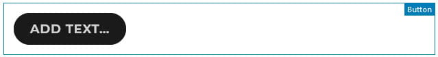
The button block makes it easy to add a button that links to other posts/pages or to an external website.
Here’s what it looks like when it’s added to the Block Editor.
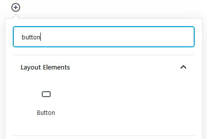
To add a button block to a post or page you click on the + icon at the left of any empty block or at the top left of the editor then search for Button, or locate it in the Layout Elements section, and click on the Button icon.
More detailed instructions for adding blocks can be found here.
Edit Text and Link
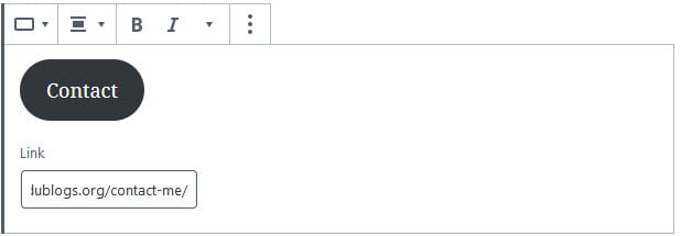
Once you’ve added the button block you type the text you want to appear on your button.
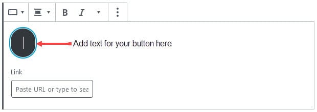
Next paste the URL of the page you want to redirect readers to into the link field.
Block Toolbar
You reveal the block’s toolbar by selecting the block. The button block toolbar includes options to change block type, alignment, bold, italics and more.
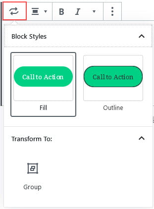
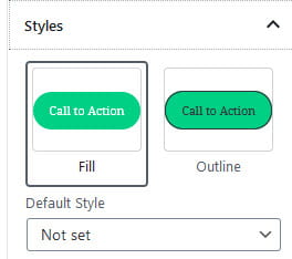
The change block type or style icon is used to transform the block to a group block or change the block style from fill to outline.
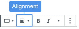
The alignment of the button block is changed by clicking on the change alignment icon and selecting the preferred alignment.
Choosing right or left allows you to place another block alongside the button block. Selecting center returns the block to the default and the button will take up the full width of the post or page.
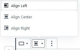
- Align left: used to align button left.
- Align Center: used to center align button.
- Align Right: used to align right button.
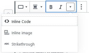
Add Inline Code, inline image and strikethrough are located under the More Rich Controls icon in the button block toolbar in addition to the option to bold and italics the button text.
Block Settings
Additional options for the button block are located in the editor sidebar of the block editor. Click on the Settings icon next to the Publish/Update button if you don’t see the editor sidebar.
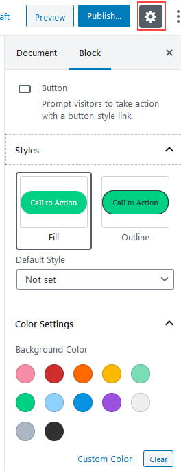
In the Styles tab you can change the button border style to fill or outline.
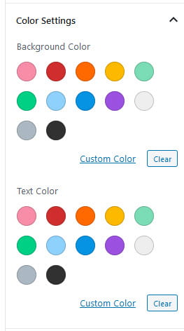
Color settings are used to change the color of the button text and background.
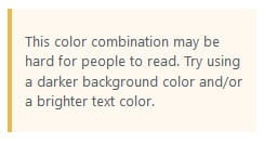
The editor includes accessibility parameters and displays a warning below the color settings if the color combination you choose make the the text illegible for those with reading impairments.
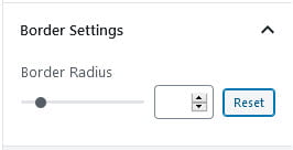
The border radius is used to control the shape of the button. When set to 0 the button is squared and roundness increases up to 50.
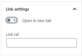
The link setting is used to control how the link opens when a reader clicks on the button.
The advanced tab lets you add a CSS class to your block allowing you to write custom CSS and style the block.