Mobile Ready Themes
The best option if you want your site to display nicely on all devices including phones, tablets and desktops, is to use a mobile-ready theme.
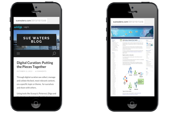
The mobile-ready themes, also known as responsive themes, are designed to optimize the theme based on which device your site is viewed on. If you view a non-responsive theme phones automatically zooms out so that your entire site can be seen. Readers need to zoom in to read your content.
Here is an example of what a responsive theme looks like on a desktop computer, tablet and smartphone.
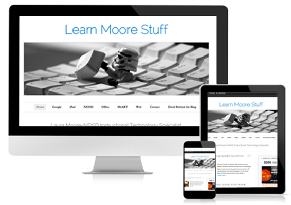
Responsive themes feel like a huge change when you’re used to non-responsive themes because responsive theme layout changes as the device size changes.
With a responsive theme, the sidebars move below the post content area and the top navigation changes or minimizes to improve reading on smaller screen.
Layout doesn’t change on a non-responsive theme as these older themes are designed to be viewed on desktop computers aren’t optimized for smaller devices.
Most websites use responsive theme designs or a mobile solution that changes the look of the website when viewed on a mobile device.