CampusPress Flex Theme Guide
CampusPress Flex has been developed by the CampusPress team as an accessibility-ready theme with 100’s of layouts and customizations ideal for all sorts of sites including schools, departments, districts, organizations, magazines, and more using the block editor.
It includes several options for menus and navigation– including the ‘mega menus’ as well as built-in Google Translate integration and CoBlocks integration.
This guide shows how to create an elaborate website using CampusPress Flex and the block editor. CampusPress Flex is not intended to be used with a page builder like the Divi Builder as a page builder isn’t required and page builders can impact site accessibility.
Branding Elements
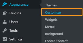
Flex provides complete control over all aspects of branding your site including your site title, tagline, logos, and more. The branding elements of Flex are changed using the Customizer.
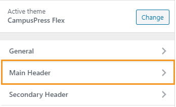
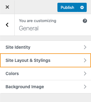
To access the customizer go to Appearance > Customize or click on Customize in the admin bar.
Logo, Site Title, Tagline, Site Icon, and Site Title Font are changed or added using the General > Site Identity of the Customizer.
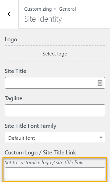
A custom link can also be added to the logo or site title.
There there is also an option to add a second logo or text to be displayed in the ‘Secondary Header’, as well as adding a Site Icon.
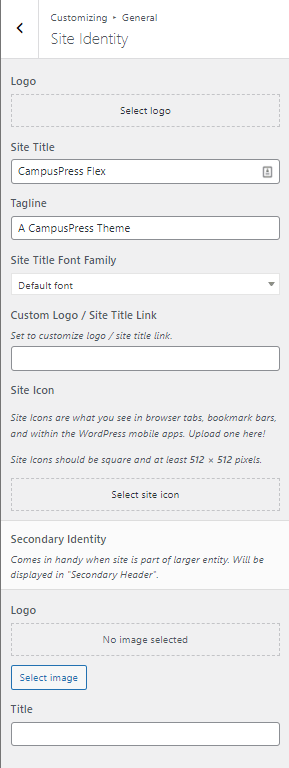
Once you are happy with the changes click Publish.
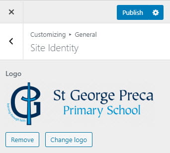
Logo
By default, no logo is set for your website. Instead, the Site Title and Tagline are displayed in the header.
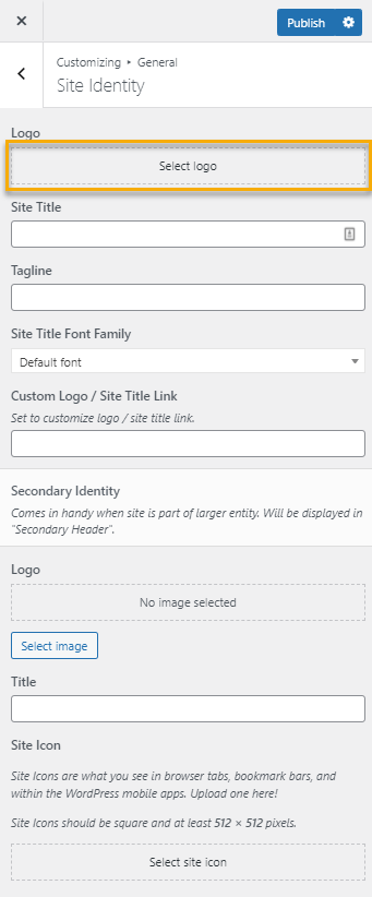
Click Select Logo and choose an image from your Media Library or upload it from your computer.
Click Skip cropping to add the entire image or select the area of the image and click Crop image.
Your Site Title and Tagline will be replaced by your Logo.
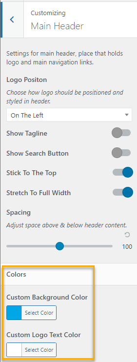
The Logo Position and Logo Image Size is adjusted in Main Header in the customizer.
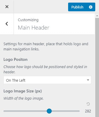
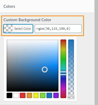
The background color behind the logo is adjusted in Main Header in the customizer.
Under the Custom Background Color option.
Site Title
If you choose not to use a Logo, the text added to the Site Title field is displayed.
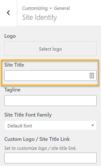
Regardless of whether you use a logo or not, the Site Title should provide descriptive information about your website as this text is displayed in Google search results.
You can also add a custom link to your logo or site title linking to an alternate destination.
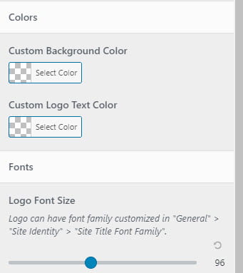
The site title text color, background color behind the Site title, and font size are adjusted in Main Header in the customizer.
Using the Custom Background Color, Custom Logo Text Color, and Logo Font Size options.
Secondary Identity
A Secondary identity could be used to display a Department logo or title when the main logo is used for the University logo.
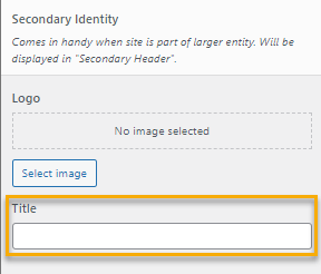
Secondary Identity – Logo
Click Select Image and choose an image from your Media Library or upload it from your computer.
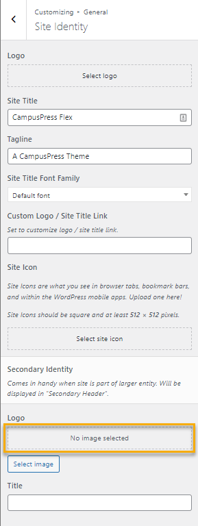
Secondary Identity – Title
If you choose not to use a Secondary Identity Logo, the text added to the Title field is displayed instead.
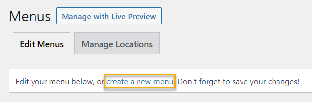
Once you have added your secondary identity logo or text title, the next step is to create a new Custom Menu in Appearance > Menus.
The Secondary Identity will not display until the secondary menu is saved.
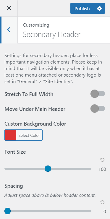
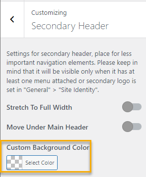
Secondary Identity – Settings
Custom background color, logo position, font size, and spacing for the secondary identity are changed in Customizer > Secondary Header.
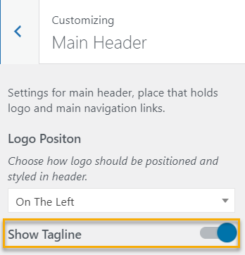
Tagline
The Tagline is displayed by default if a logo isn’t added. The Tagline is displayed in a smaller font below the Site Title.
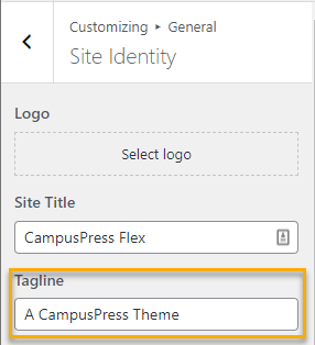
Regardless of whether you use a logo or not, the Tagline should provide descriptive information about your website as this text is displayed in Google search results.
You are able to choose to hide the tagline in Main Header in the customizer.
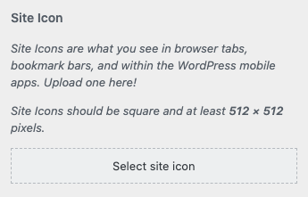
Site Icon / Favicon
The Site Icon (or Favicon) is used as an icon in browser tabs and as an image icon in the event that someone saves your website as a phone or desktop shortcut. The image should always be square and at least 512 x 512 pixels in size.
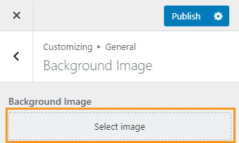
Background Image
A background image can be added using General > Background Image.
Click Select Image and choose an image from your Media Library or upload it from your computer.
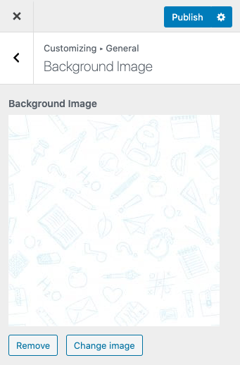
This image acts as the default background for your entire website anywhere that an image or color hasn’t been defined.
When Boxed Design is selected in General > Site Layout & Styling the background image is displayed outside of the boxed area.
Site Layout
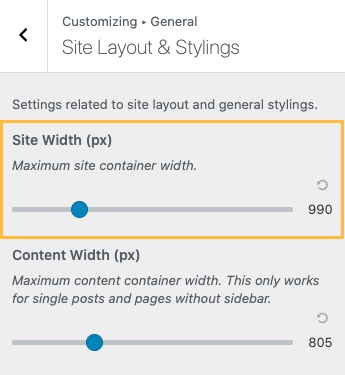
Layout settings affect the site structure and width on desktop devices. All settings for layout can be found in Customize > General > Site Layout & Stylings.
Site Width
Settings for “Site Width” affect maximum width for Main Header, Footer, Pages, and Posts with a sidebar. It is recommended that Site Width be set between 860 and 1360 pixels.
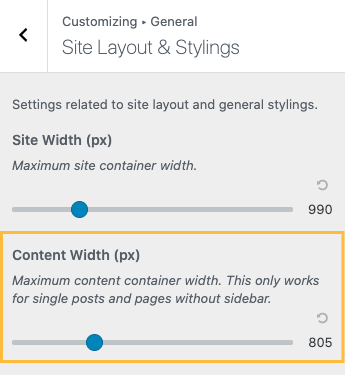
Content Width
Settings for “Content Width” affect the maximum width on posts and pages without a sidebar. Width between 860 and 1360 pixels suits most visitors.
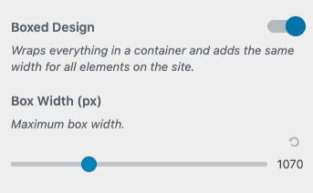
Boxed Design
Enabling Boxed Design places the site content in a wrapper and displays the same widths for everything on the page, including Main Header, Secondary Header, and Footer. When enabled, a setting for maximum box width is shown.
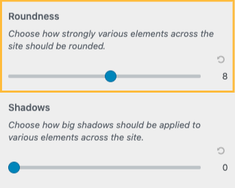
Roundness
The theme offers global settings for roundness on a few elements on the site. Roundness is applied to buttons, search icons, or certain widget items.
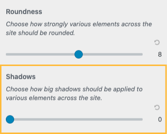
Shadows
Various elements of the theme can also have blurred shadow effects and this setting affects the intensity of it. This is applied around the menu and footer, but also under buttons.
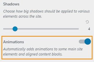
Animations
Animations can look great on certain websites, might be you like them! So, we included it. Once activated it applies different kinds of effects to elements as the element scrolls into view such as fade, flip, zoom, rotate, and so on.
Colors
CampusPress Flex simplifies the process of creating an accessible color scheme by automatically styling text and button colors when background colors are set. This makes it easier to set colors without having to worry about using the correct color contrasts.
The main color settings are changed in Customize > General > Colors.
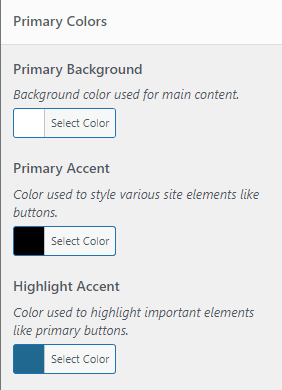
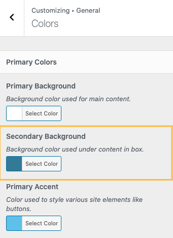
Primary Colors
The primary color settings control the colors used in three areas of your site:
- Primary Background: The background color used in the main content area.
- Primary Accent: The color used to style various site elements like buttons.
- Highlight Accent: The color used to highlight important elements like primary buttons.
A new color option is displayed in the Primary colors section if the “Box Design” is enabled in Customize > General > Site Layout & Stylings.
Secondary Background: The background color used under the main content area.
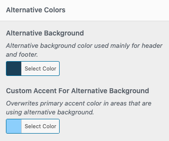
Alternative Colors
The alternative color settings control the colors for:
- Alternative Background: The color used for your site’s header and footer.
- Custom Accent For Alternative Background: This color setting overwrites the primary accent color in areas that are using the Alternative Background color.
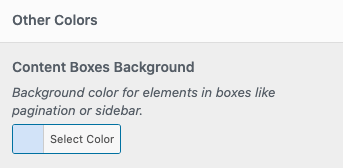
Other Colors
Content Boxes Background: This sets a background color for elements in boxes like Sidebars.
Other color customization can be set under the Main Header, Secondary Header, and Footer sections.
Main Header
The main header color is changed in Customize > Main Header.
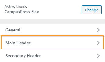
There are two color options for the Main Header:
- Custom Background Color: Changes the background for the Main Header.
- Custom Logo Text Color: Changes the color of the site title and tagline.
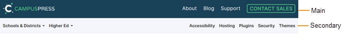
Secondary Header
The secondary header color is changed in Customize > Secondary Header.
Below is an example of a main header and secondary header being used with CampusPress Flex.
Footer colors are changed in Customize > Footer using the Background/Overlay color option.
Fonts
Available fonts are limited because loading too many fonts has a negative impact on site speed. CampusPress Flex includes some of the most popular web fonts chosen based on easy-to-read and works well on all screen sizes.
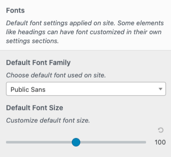
Default Font
The Default Font Family and Default Font Size for your site is set in Customize > General > Site Layout & Stylings.
This is where you can adjust your default font size.
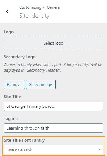
Site Title Font
The font used for the Site title and tagline is set in Customize > General > Site Identity.
The font size of the Site Title is changed in Customize > Main Header using Logo Font size.
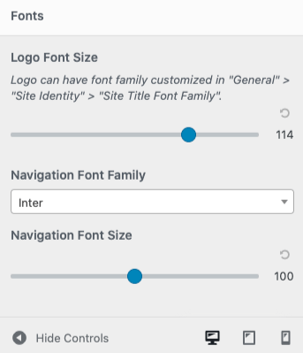
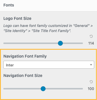
Navigation Font Family and Navigation Font Size for your site are set in Customize > Main Header.
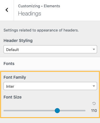
Headings Font
The font family and font size for your site’s headings are set under Customize > Elements > Headings.
Hero
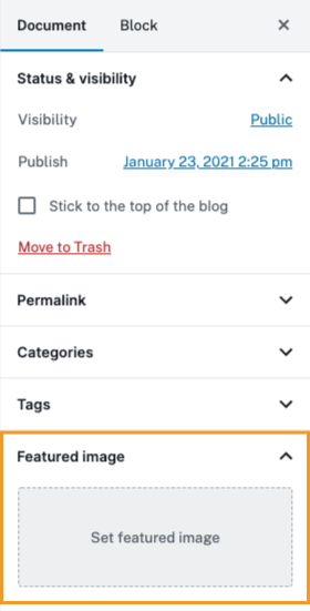
If a Featured Image is added to a page or post it is automatically applied as the Hero Image.
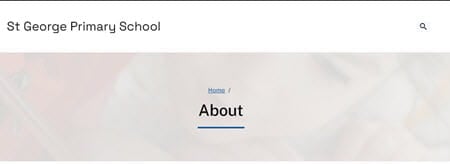
By default, the hero image is displayed below the main header behind the post/page title.
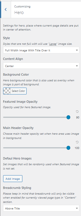
The Hero Image style is customized in Customize > Hero.
Customization options include Style, Content Align, Background Color, Featured Image Opacity, Main Header Opacity, Default Hero Image, and Breadcrumb Styling.
Content Settings
Default content display settings for post lists, single posts, and pages can be found in Appearance > Customize > Content.
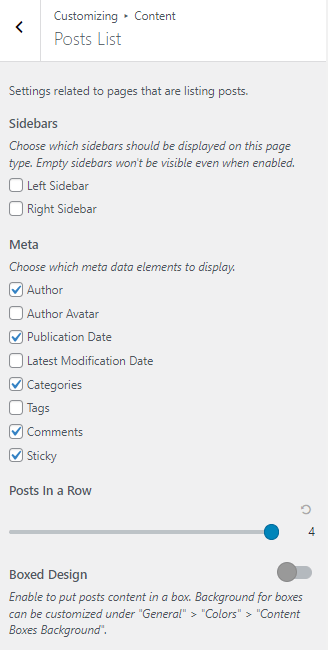
Post Lists
These default settings are applied to the static posts page that lists all your posts, and can be found in Appearance > Customize > Content > Posts List.
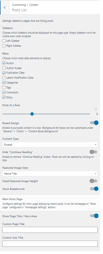
These settings include:
- Sidebars – Choose either the Left sidebar or Right sidebar to be displayed on the page listing all posts.
- Meta – Choose which meta data elements to display with your post list.
- Posts in a Row – This setting allows you to adjust the number of posts to display in a row, from one post to a maximum of four posts on one row.
- Boxed Design – when selected, the post content is ‘boxed’; the background color for boxes can be selected under General > Colors > Content Boxes Background.
Other settings include:
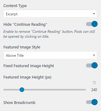
- Content Type – select whether to display an Excerpt, Full Content, or No Content in your post feed.
- Hide “Continue Reading” – if selected, this removes the “Continue Reading” button. Posts can still be opened by clicking on the post title if selected.
- Featured Image Style – Here you can display your featured image above the post title, under the post title, or disable the featured image completely.
- Fixed Featured Image Height – adjust the featured image height in pixels
- Show Breadcrumb – opt to display or disable breadcrumbs in the post list.
Main Posts Page
These settings are applied to main page displaying your recent posts. This can either be the Homepage or “Posts page” which are configured in Customize > Homepage Settings.
- Show Page Title / Hero Area – either show or disable the page title area in the Hero section
- Custom Page Title – set a default custom page title for the post feed, this will over-ride the page title
- Custom Sub-Title – set a default custom sub-title for the post feed.

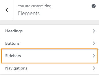
Sidebars and Widgets
Sidebars
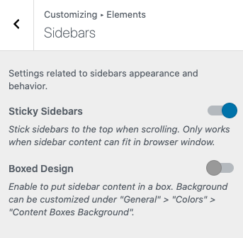
Sidebars appearance and behavior is changed in Customize > Elements > Sidebars.
Design options are:
- Sticky Sidebars – Activating Sticky Sidebars will stick the sidebars to the top when scrolling. This will only work if the sidebar content can fit in the browser window.
- Boxed Design – When Boxed Design is enabled the sidebar content area will be enclosed in a box. The background can be customized in Customize > General > Colors under ‘Content Boxes Background’.
Widgets
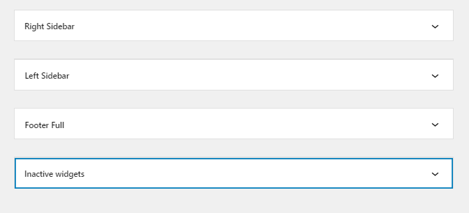
Widgets can be added using the Customizer (Customize > Widgets) or via Appearance > Widgets.
In Appearance > Widgets you have access to all three widget areas, including a inactive widgets. The Right sidebar widget area is used by default with single posts and pages that are listing posts. The left sidebar is used by default on pages.
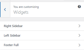
The widget area displayed in the Customizer is controlled by the page you are viewing when adding widgets. For example, if you navigated to a page on your site while using the Customizer it would display an option to add widgets to the left sidebar and footer full widget area. If you were viewing a post or a blog post page you would see the option to add widgets to the right sidebar and footer full widget area.
Your footer area is used for content you would like to show at the bottom of all your pages such as a copyright notice, disclaimers, privacy notice, contact information.
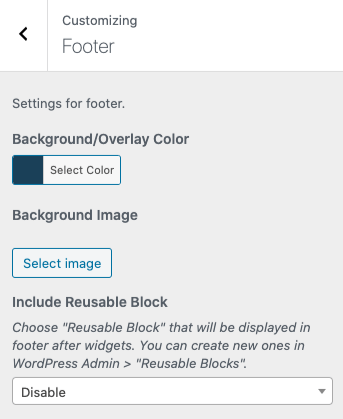
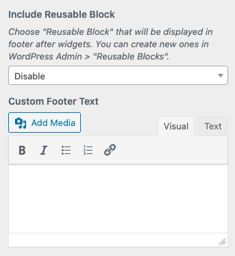
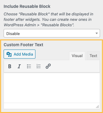
The Footer is changed in Customize > Footer and includes an option to set Background/Overlay Color, background image, add a Reusable Block and add Custom Footer Text.
Background/Overlay Color
Here you are given the option to set a Background/Overlay Color, as well as a Background Image for the footer area if required.

Reusable Block
Another useful setting related to your Footer Area is the ability to add a Reusable Block from the dropdown menu under ‘Include Reusable Block’.
With Reusable Blocks, you can expand your footer to include a visually rich content area that will display after any widgets used.
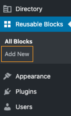
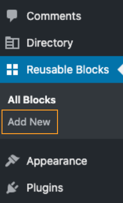
You can create a Reusable Block from your dashboard under Reusable Blocks > Add New.
In the ‘Custom Footer Text’ field, you are able to add media content, as well as a text field for basic content.
Menus
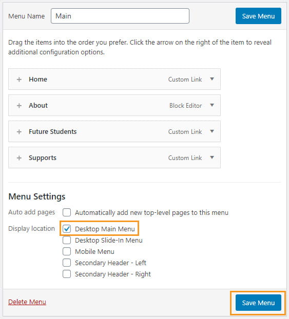
Your navigation menus can be created by setting up a custom menu in Appearance > Menu.
Note: Second Level drop-down menus are not possible with CampusPress Flex, which was developed as an accessibility-ready theme. Drop Down Menus, or Fly-Out Menus can be difficult to navigate for users with mobility impairments.
Display Locations
CampusPress Flex includes the option to display custom menus in five different locations providing greater control and customization of your navigation menus.
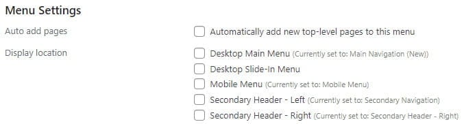
Once you’ve created a new custom menu select the display location and then click Save Menu.
Google Translate
Google Translate can be added to your site using your navigation menu as follows:
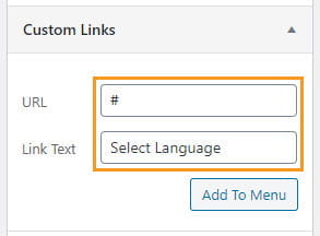
1. Click on the drop-down arrow next to the Custom Links menu item in Appearance > Menus.
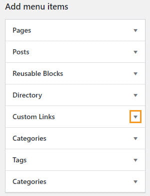
2. Add # for the URL and Select Language for the Link Text and click Add To Menu.
3. Open up the menu item settings for Select Languages and select Open Translate Dropdown from under the Custom Action On Click dropdown menu.
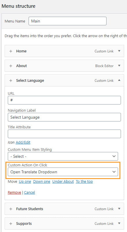
4. Select the Display location and click Save Menu once you’ve finished customizing your custom menu.
Menu Icons
CampusPress Flex includes an option to add an icon to your menu items.
You add an icon by clicking on Add/Edit next to the icon on the menu item setting for the item you want to add an icon to.
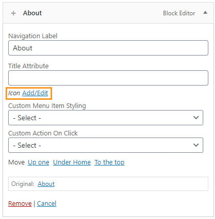
A Choose Icon window launches. Select the icon you want to use, select if you want to hide the label so only the icon shows in the menu, place the icon before or after the label, the icon color, and icon background color then click Save.
Reusable Blocks Menu item (Mega Menu)
Reusable Blocks allows you to expand a menu link into a full-width visual display with images, video content, text and links to create a mega menu.
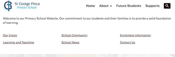
The About link in the custom menu in the image below was added using a reusable block.

When a site visitor hovers over About the mega menu loads.
A Reusable Block menu item is created as follows:
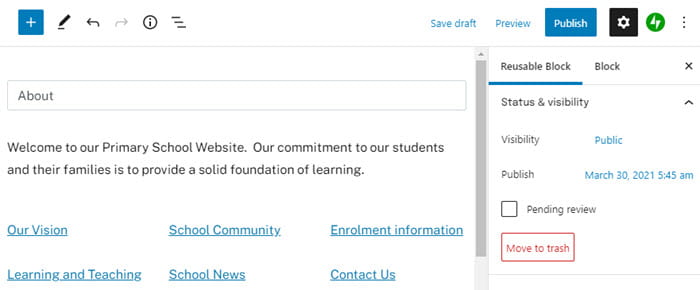
1. Go to Reusable Blocks > Add New.
2. Add your title, add your blocks and click Publish.
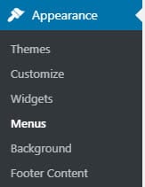
3. Go to Appearance > Menu.
4. Click on the drop down arrow next to reusable blocks menu item.
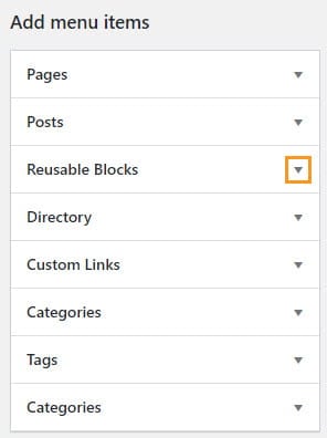
5. Select the reusable block you want to add.
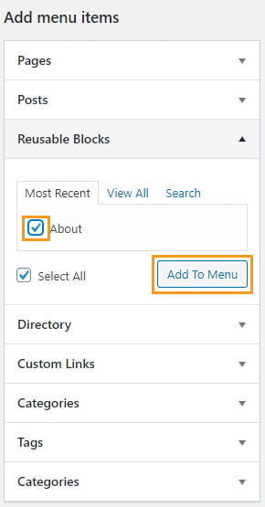
6. Select Display location and click Save Menu once you’ve finished customizing your custom menu.
Pages and Posts
CampusPress Flex is designed for the block editor and includes co blocks plugin integration which adds over 20 extra blocks to the WordPress block editor. For best results we recommend pages and posts are created using the block editor.
Avoid using page builders like the Divi Builder as these can impact the accessibility of your site.
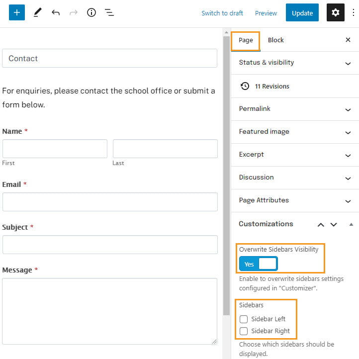
Sidebar Visibility
Sidebar settings for each post/page can be overwritten regardless of what is set on the customizer using the “Overwrite Sidebars Visibility” under the “Customizations” option in the block editor.
Only the footer area is displayed if Yes is selected for “Overwrite Sidebars Visibility” and no sidebar selected.
Disable Page Title/Hero Area
You can disable the Page Title and Hero Area on a page or post in the block editor by selecting Yes in “Disable Page Title/Hero Area” under the “Customizations”.
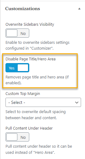
You can pull content under the header so it can be used instead of “Hero Area” by selecting Yes in “Pull Content Under Header”.
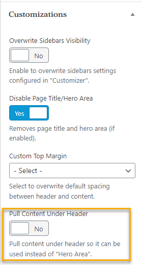
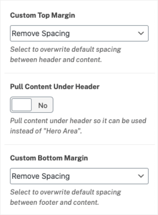
Disable Top/Bottom Margins
You can disable the Top and Bottom Margin on pages and posts in the block editor by selecting “Remove Spacing” from the dropdown under “Custom Top Margin” or “Custom Bottom Margin” in the customizations options. When selected, a new option appears to pull content under the header so it can be used instead of “Hero Area”
Directory
CampusPress Flex includes the custom post type Directories that can be used to build staff directories, building directories, academic program directories.
You create a staff directory as follows:
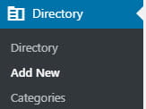
1. Go to Directory > Add New.
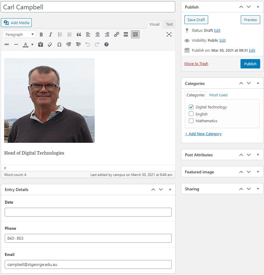
2. Add the person’s name and their information, their phone number, their email address, assign the category and click Publish.
3. Repeat the process to create a directory entry for each staff member using Directory > Add New.
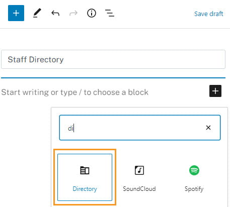
4. Create a new page for your directory using Page > Add New once you’ve added all directory entries.
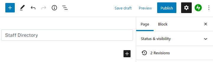
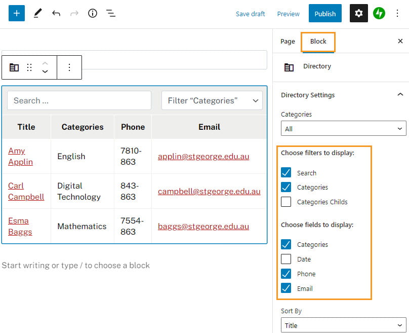
5. Add your directory to the page using the Directory block.
6. Click on the block to choose the filters to display and the fields to display and then click on Publish.
CampusPress Flex is designed to work well with Advanced Custom Field Pro. Activating Advanced Custom Field Pro allows you to add as many custom fields as you want to the directory custom post type.
The alternative directory option is to add using Advanced Tables plugin.
Alert Notifications
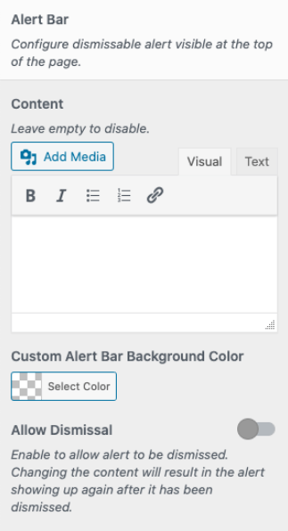
Alert Notifications is used to display a message that can be dismissed to the top of your site. This is very useful if for displaying alerts or messages.
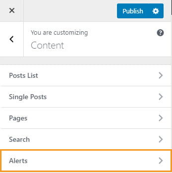
Alerts are added using Customize > Content > Alerts.
Content
In the Content container, you have the option to Add Media, as well as basic styling and a custom background color for the alert bar.
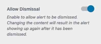
Allow Dismissal
Toggling the ‘Allow Dismissal’ switch gives the option to dismiss the alert. The alert will reappear if a visitor has dismissed it if the content changes.
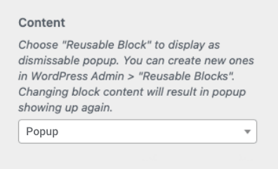
Popup With Alert
You also have the option to use a Reusable Block to display as a dismissible popup alert, by selecting the Reusable Block from the drop-down menu. Any content that is changed in the block will result in the popup showing up again.